

Now that the dust has settled since Pantone announced Cloud Dancer as their colour for 2026, we decided to create our own mood boards based around some beautiful interior room settings, where white either takes centre stage or provides the perfect back drop for other colours and textures to pop! We have featured Emporio Skin decor samples as the base for all our schemes, taking full advantage of their versatility, diversity and realism!
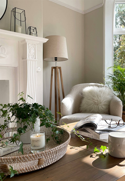
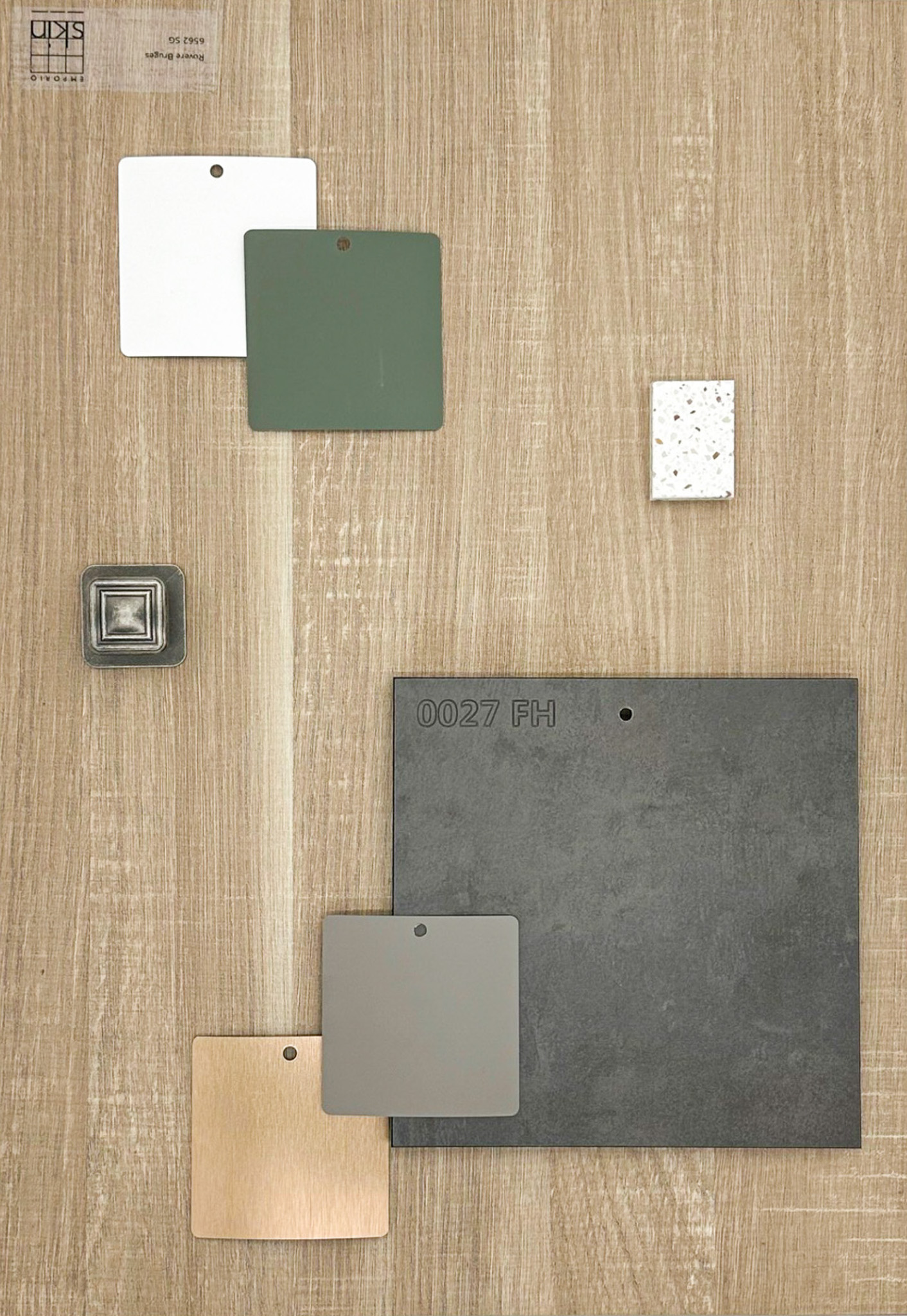
White and neutral tones create a perfect canvas for this Scandi - inspired interior space, allowing other materials and textures to take the spotlight.
Rovere Bruges offers a natural wood tone, perfect for a Nordic flair. The white decor sample accentuates the detail of the woodgrain, while the softened grey and green colours complement the overall look and feel with a hint to nature.
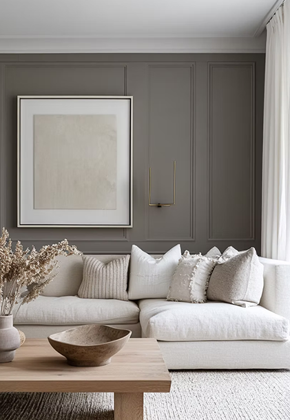
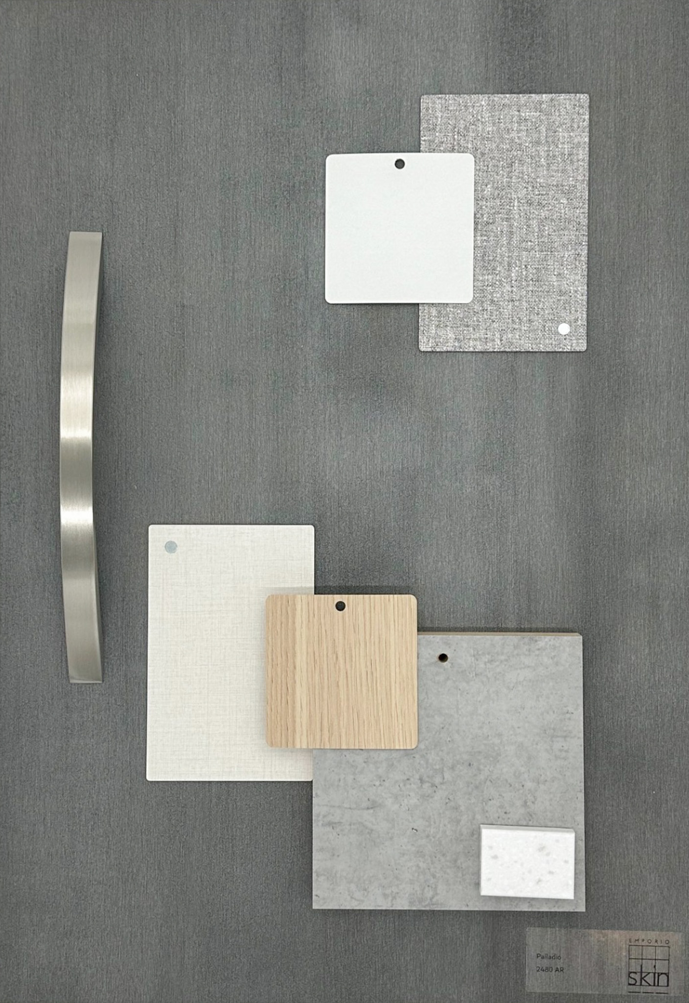
Working the opposite way round, white accessories and furnishings are the perfect softener to a bolder wall colour. Even though the grey is dark, white keeps the space light, creating balance.
We have paired Palladio up with some beautiful woven texture effect decors for added depth and character and the light woodgrain brings a warmth to the design.
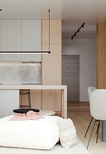
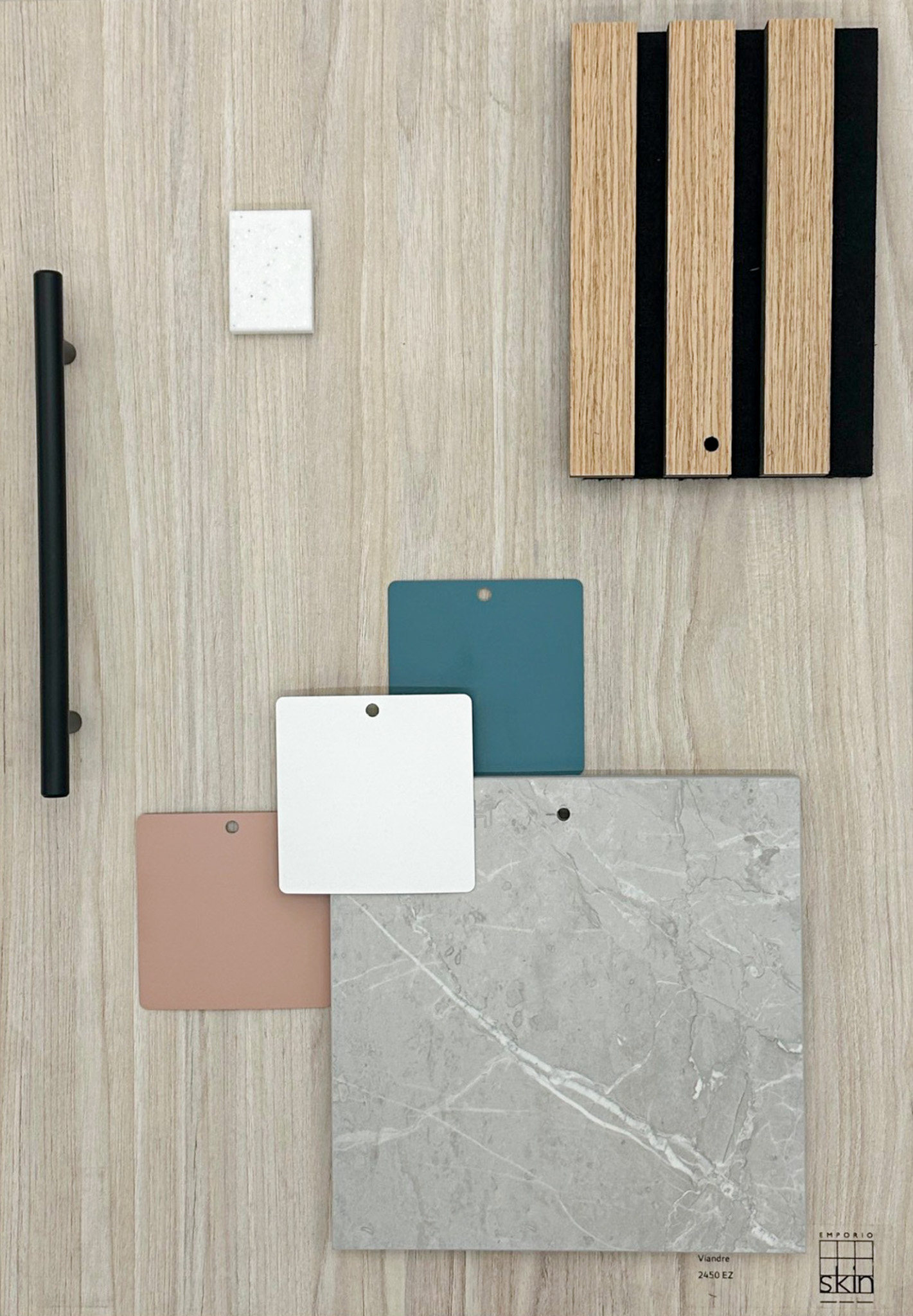
This modern kitchen design showcases a variety of wood and marble effect materials, using black accessories as stunning accents - the key to uniting all of these elements? You got it, white!
Viandre is more than just a light woodgrain, its almost a little magic! The pink, blue and especially white hues can all be found in its colouring. The white decor also pulls out the veining of the marble tile.
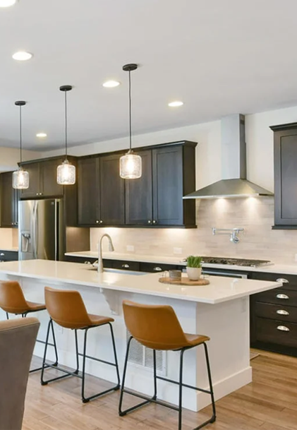
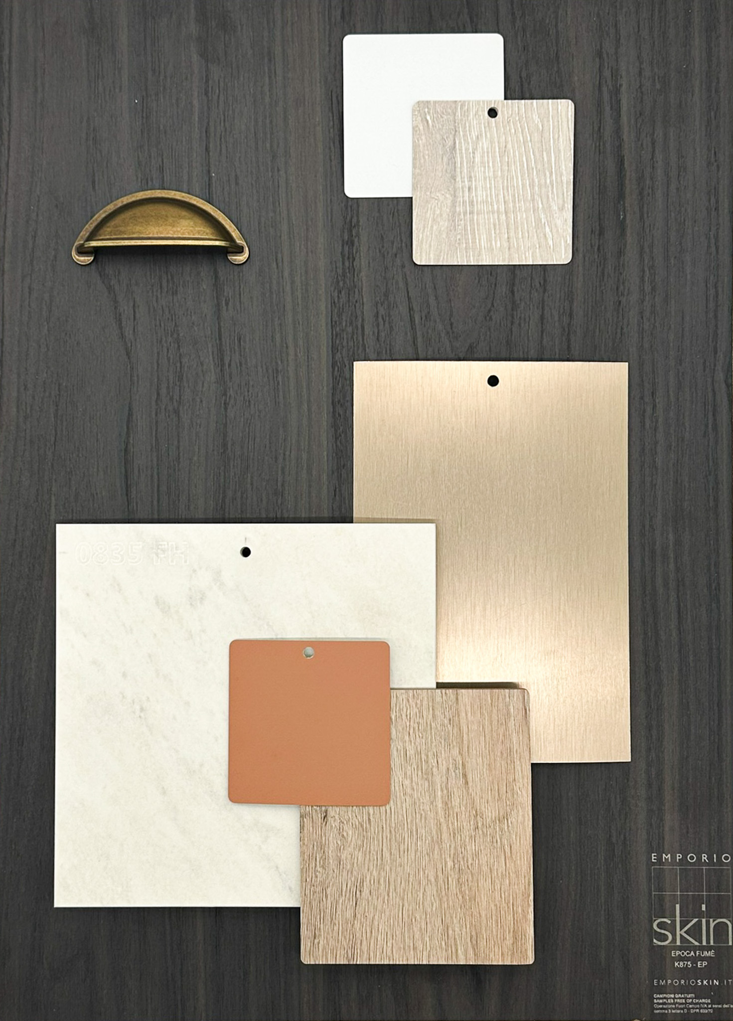
The white surrounds of this kitchen area, really allow you to appreciate the intensity of the ultra dark woodgrain. The space still feels light and airy and we love how much the white island really emboldens the accent orange colour.
Epoca Fume's decadent appearance is certainly softened by introducing white tones alongside lighter woodgrains and brushed metal. The addition of the orange really does warm the white too.
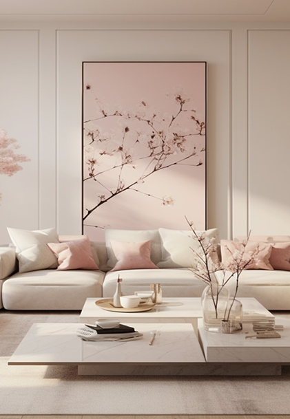
This Japandi inspired living area blends the Zen simplicity of Japanese design with the warm, functional comfort of Scandinavian style. This neutral palette of white and soft pastels creates a serene, cosy ambience.
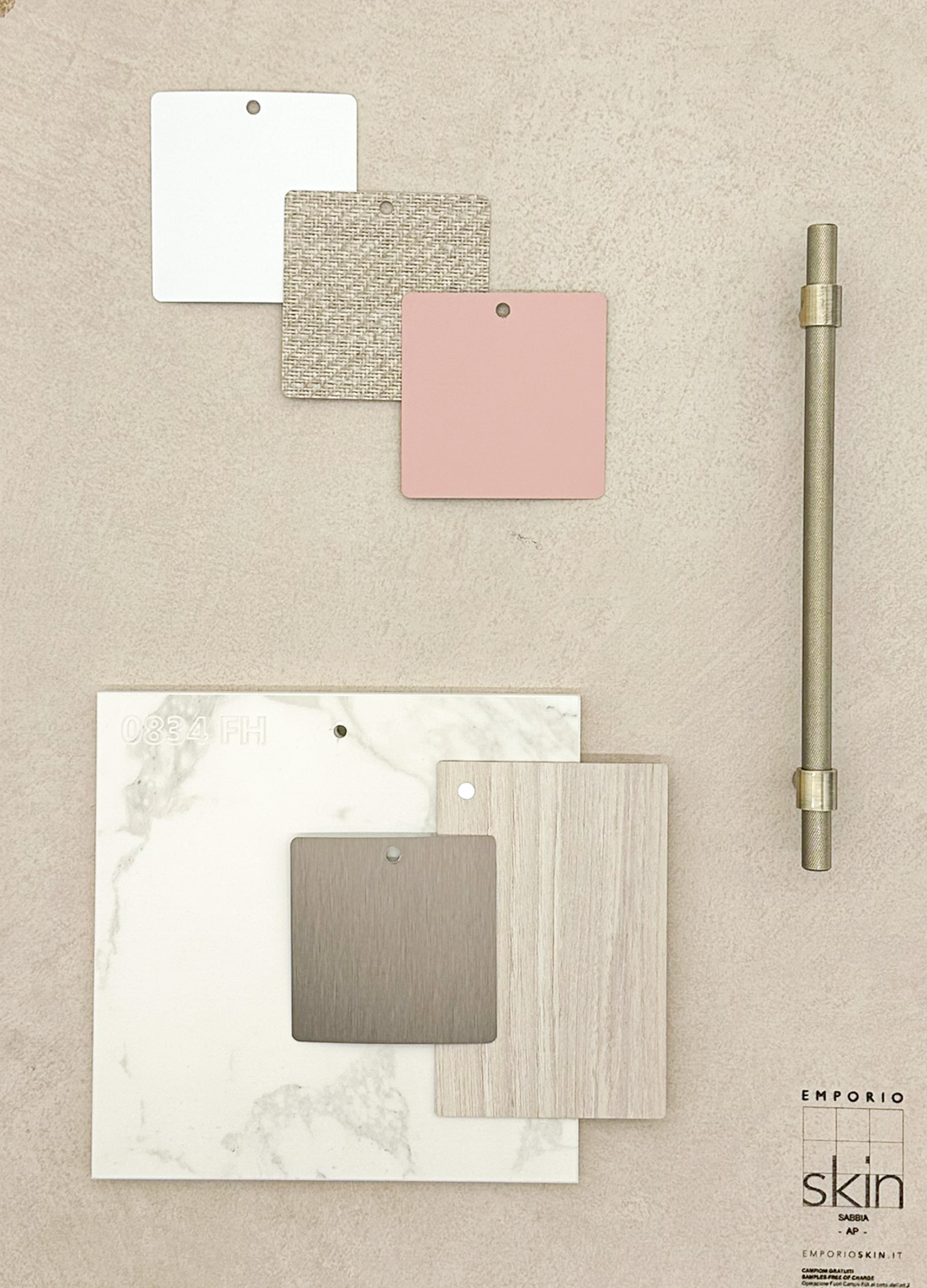
Sabbia's softly brushed appearance offers the ideal backdrop for the subtle tones in this scheme. The dreamy combination of delicate texture, woodgrain and muted brushed metal certainly have us feeling at ease.
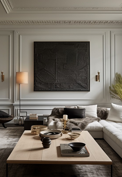
There's no hiding for white in a monochromatic interior scheme, it has as much importance and limelight as the darker tones it works with.
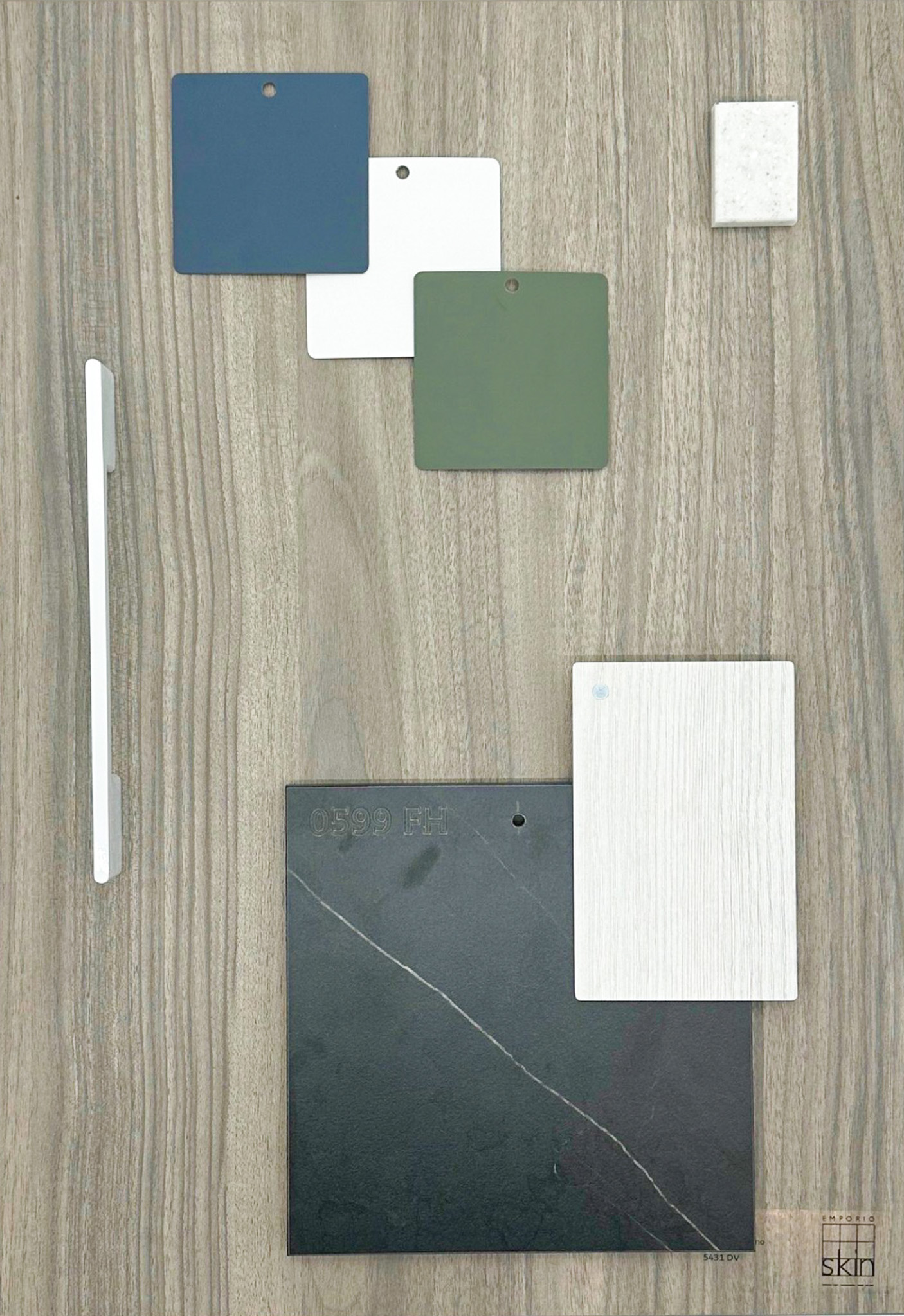
Like Viandra, Caracalla Fumo is another decor that possesses colours within the grain that are brought to life when used with another colour, like the green, blue and white we've demonstrated here.
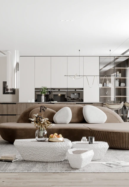
We love this sophisticated open plan interior. The upper part of the room being white with the darker woodgrain below, creates the illusion of more height and space.
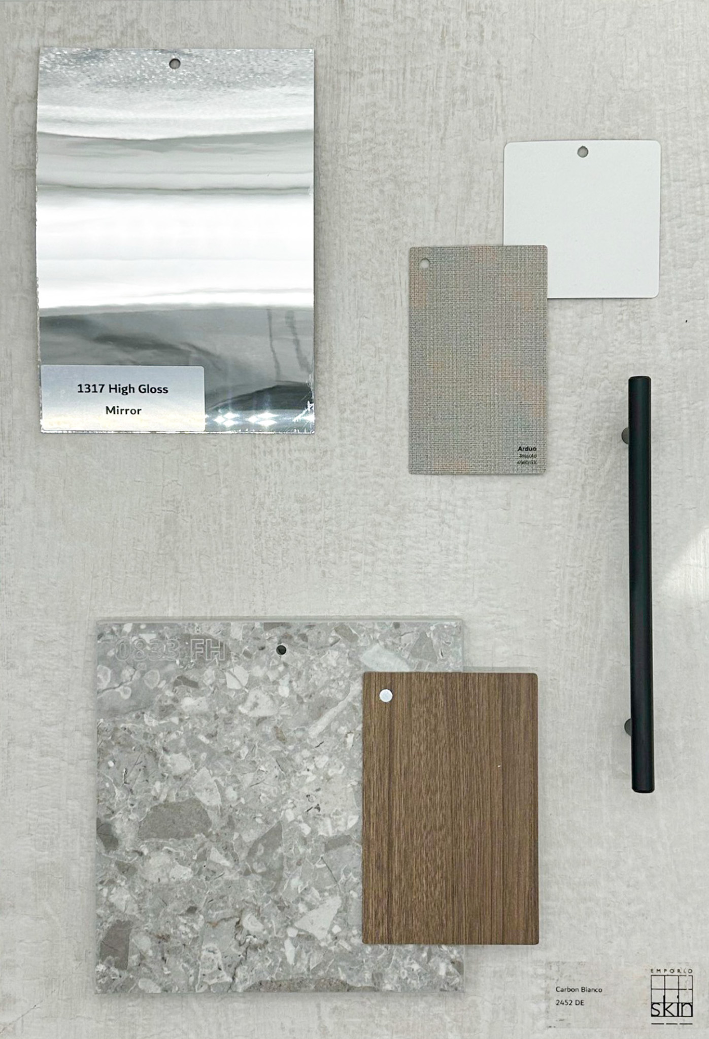
Set on Carbon Bianco, we can feel a sense of openness already, the mirror gloss is a great way to enforce this further too. By incorporating the mottled tile and fabric-look decor with the woodgrain adds interest and character.
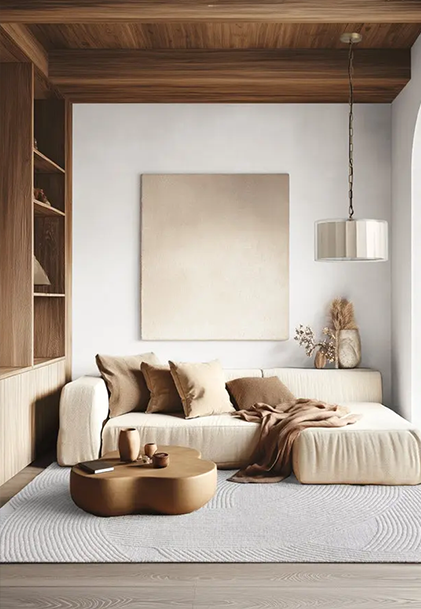
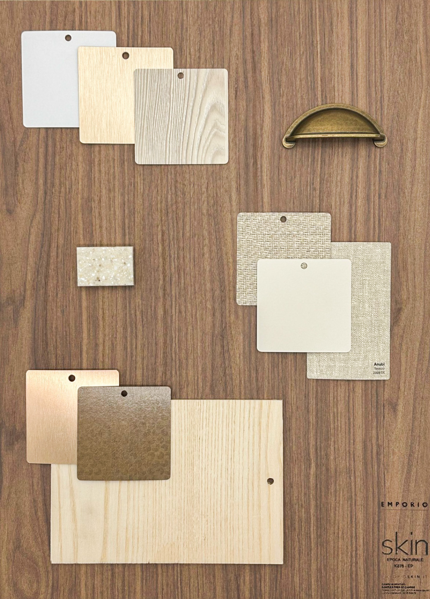
We are loving the natural, earthy tones in this interior space. A nice collab of hues similar to last years pantone colour (Mocha Mousse) offering a beautiful contrast with this years chosen shade.
Set against the sumptuously rich Epoca Naturale, we've really played with texture incorporating veneer and a variety of fabric-effect melamine decors. Together with accents from the brushed metals, they evoke a feeling of understated luxury.
The thing that stands out in all of these interior images, is the serenity and calm that exudes from each space, no matter the colours or textures that are in accompaniment. The common denominator - white! The versatility of white means it can be the star of the show or the backdrop for other colours to do their thing. Its ability to create the feeling of space, height, width, calm, cleanliness; to lead or support a design and to keep things uncomplicated, in the fast-paced, busy, non-stop world we live in today, is no mean feat, but white delivers every time!
To view some of the white decors we stock then click here, but don't forget there are lots more in the form of laminate, worktop and solid surface materials if you visit our website and want to refine your search further!